Sans Serif fonts vs. Serif fonts
In world of proportionally spaced fonts (as opposed to mono-spaced fonts) there are basically two sorts of fonts. Those with serifs and those without serifs. The ones with serifs are called “serif” fonts, and those without serifs are called “sans serif” fonts—seriously.
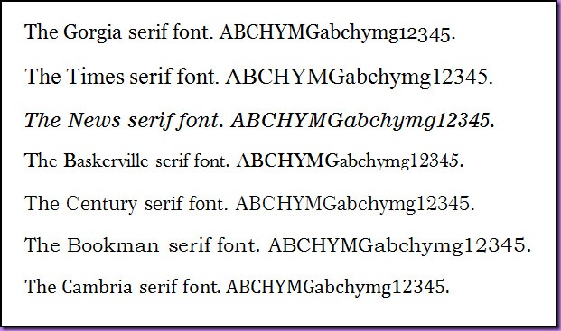
Serif fonts: Serifs are sometimes called “hints” or “readability hints” or “readers”, or sometimes just those curly bits on the ends of letters. The following image shows some common examples of serif fonts.
There are many thousands, if not tens of thousands, of different serif fonts (now that anyone with a computer can basically develop a new font in a few days) but it is estimated that 95% of material set out using a serif font will come from the top 120 serif fonts.
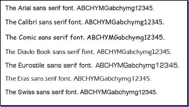
Sans serif fonts: Sans serif fonts, meaning fonts ‘sans’ or without the readability hints or serifs are sometimes referred to as technical fonts or heading fonts. The following image shows some of the more common sans serif fonts.
As is the case for serif fonts there are thousands of different sans serif fonts and as for serif fonts the most used sans serif fonts are in the top 80 with Helvetica and its derivatives (such as Arial and Swiss) being the most used sans serif font style.
What font to use when: The whole idea behind selecting a font is to choose a font that assists your reader in reading and comprehending your ‘copy’—the text you are preparing.
- When presenting copy on the relatively low-resolution low-contrast medium of a computer screen—which will typically be 72 dpi and is at its very best a resolution of 96 dpi—then text is best presented using a sans serif font.
There are four reasons you can get away with using a sans serif font for body text when used on-screen.
(a) It looks better. Using a sans serif font when displaying copy on a computer screen provides the illusion of additional contrast (black against white) and crispness that is lacking due to the technically low display resolution of the screen.
(b) The second reason you can use a sans serif font on a computer display is that the line length is typically very short (about 12 words per line or less) and using a short line length is one of key rules when picking a sans serif font for body text. Using a longer line length with a sans serif font can drop the readability index dramatically.
(c) The line spacing used for screen text is usually generous (i.e., quite wide, compared to printed copy). It has been proven, up to a point, that increasing the line spacing improves readability and comprehension for the reader.
(d) People reading copy from a screen will typically be reading the text from about an arm’s length away (about 200 cm) and often the text is not viewed at 100% or exact size. It could be sized down, but more often it is sized up.
Note the following example taken from the screen. Short line length and good line spacing. - When it comes to printed output the rules are very different. Universally and without exception all professional copy editors use serif fonts for copy that is indended to be consumed by the reader as printed material. Unlike text on the screen, text on paper—even when the paper is not white—has a much higher contrast. Additionally the resolutions start at 300 dpi and go up, with novels printed at 600 dpi and magazines printed at 1200 dpi or higher.
In addition the reader will typically be reading the copy from a distance of about 40 mm (compared to 200 cm with on-screen copy).
The three top reasons a serif font should always be used for printed copy.
(a) When it comes to printed material the readability index for serif fonts compared to sans serif fonts is 41% higher for the average reader. This comes about because when reading printed text we decode a high percentage of the words based on their shape and not so much on picking out the actual characters in the word. Studies show that when a sans serif font is used we are less adept at decoding words based on shape and have to ‘slow down’ and decode them considering the individual characters making up the word.
(b) When longer lines are used (longer than 10 to 12 words) the average reader needs to re-register more often if the copy is set out using a sans serif font, with the re-registration frequency increasing as the line length increases. This means that using a sans serif font for longer lines causes the reader to lose their place more often in the paragraph as they swing back from right to left picking up the start of the next line of text.
(c) Using smaller san serif fonts can impact the readability of copy significantly. Dropping from a sans serif 10 point font down to 8 points has a significant impact on readability. However, as and when needed to make the layout work (fit) editors can drop from 10 points to 9 or 8 points using a serif font with minimal disruption to readability.
Some publications take the serif versus sans serif issue so seriously that they go to the trouble of putting their on-screen copy up using a sans serif font, but then if you print the article it will convert to and print in a serif font. As can be seen from the example below National Geographic are such a publisher.
And yes, so it was a true representation, I actually printed this on my Samsung ML-2010 laser printer and then scanned it using my Epson Perfection 1650 flatbed scanner, and then edited it using Photoshop Elements 8 (levelling and re-sampling only) before posting it (the trouble I go to so everything is kosher). Note that this is the same piece of copy used in the example before from National Geographic where on-screen they use a sans serif font. Notice that in the printed version the lines are also longer to suit printed output, and the font is now a serif font.
Remember that to get this scanned image into the 64o pixels of width my blog column allows I have had to resample the scan down, hence the text does not show as being anywhere near as crisp as it does on the actual printed page I scanned. Also scanning always causes things to be slightly softened (which is one of the reasons why we have sharpening/un-sharpening tools in image editors, but that is a whole other post).
Well there is more I could say but I am way past my 500 to 600 word guide for a post. I am up to 1,123 right here.
In a nutshell:
Unless there are other factors at play then:
- Use san serif for on screen body text and serif fonts for copy that is intended to be consumed as hard copy (printed).
- If you use a san serif font either on screen or for print (for whatever reason) it is a good idea to increase the line spacing.
- When using san serif fonts be aware of the line length. Anything over 12 words long and the readability will drop away dramatically.
- San serif fonts are often used for headings with printed text (hence the reason they are sometime referred to as ‘heading fonts’).
Closing thought: There is a very good reason that legal documents are printed using long lines, the smallest of line spacing, and a sans serif font; and it is NOT to save paper.


