Oops! Made a Mistake with Trying Out Various Fonts
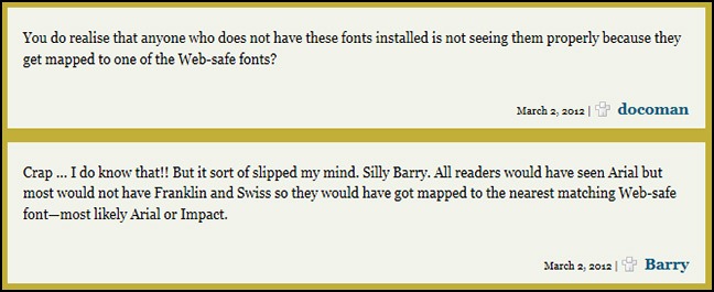
Somehow I managed to forget that with changing fonts for Web content everyone does not have every font. Honestly, I did know this but it slipped my mind there for a bit. Thanks to ‘docoman’ for being on the ball and reminding me of this.
Part of the problem is that it worked perfectly for me on both my main PC and my test PC because I have these fonts on both PCs.
Anyway, bottom line, the vast majority of people out there would not have seen the postings I did using the Swiss or Franklin fonts as they should have looked.
For the Swiss font posting—which was about cupcakes—the font should have looked like this . . .
For the Franklin font posting—which was about whether to use serif or sans-serif fonts—the font should have looked like this . . .
This posting is being done using Lucinda Unicode 12pt which is supposed to be Web-safe, meaning almost everyone should have it on their computer; so you should be seeing this font correctly.
If the above paragraph does not look like the following image then you are not seeing Lucinda Unicode.
At this stage, of the sans-serif fonts I have tried I sort of do prefer this one. It is solid, not too skinny, and has pleasing default line spacing. If I were to swap permanently over to a sans-serif font this is probably the one I would pick at this point.


